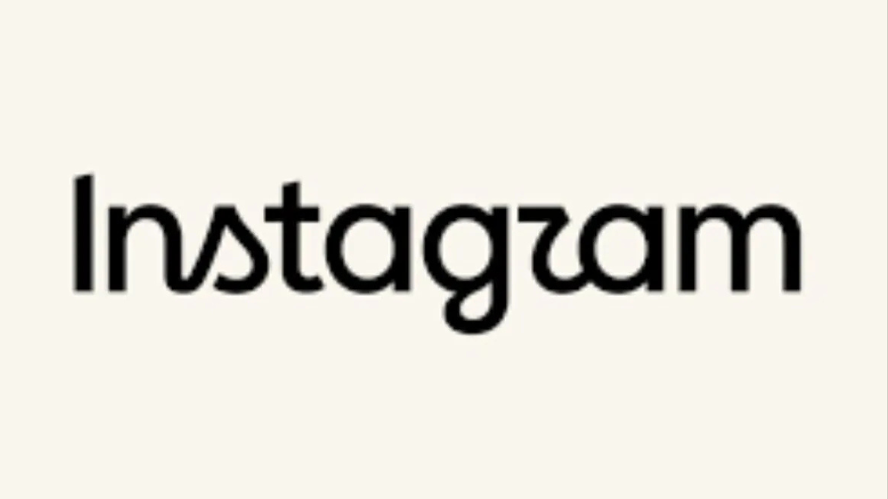


Instagram has refreshed its wordmark for the first time in nearly a decade, giving one of its most recognisable brand elements a new look while retaining its iconic camera logo.
Instagram head Adam Mosseri said the wordmark had remained unchanged for around 10 years and that the platform was now ready for a refresh. The redesigned lettering blends cursive and print-inspired elements, creating a more contemporary treatment while retaining visual cues associated with Instagram's original identity.
The wordmark update forms part of a broader refresh of Instagram's visual identity. The platform has also refined its Instagram Sans typeface and introduced two additional typefaces — Instagram Pen and Instagram Mono — to offer greater flexibility across its visual communications.
Instagram's signature gradient has also been retained, although its use has been made more subtle and adaptable across different applications.
The refreshed identity is designed to reinforce Instagram's focus on creativity and self-expression. Jasmine Probst, director of product design at Instagram, said the cursive elements of the new wordmark were intended to reflect individuality and personal expression.
The updated visual system will be rolled out globally, with implementation expected to continue through 2026 and beyond. Instagram said the refreshed system is designed to give greater prominence to content created by its community.
The new wordmark has already sparked mixed reactions online, with some users questioning its readability and drawing comparisons between the new lettering and different interpretations of the word “Instagram.”